Weekly Entries
September 6th A Strange Relationship: Images and Text
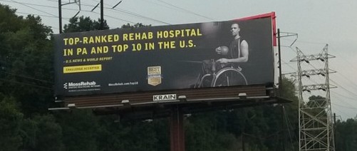
Moss Rehabilitation Center
|
While reading chapter one of Kress and Van Leeuwen's "Reading Images: The Grammar of Visual Design", I found myself feeling a little muddled by the various terms used to describe the relationships between text and images. I suppose this is probably due to the fact that I've never really thought about images this way; pulled them apart piece by piece and then looked at how those pieces might fit together, and why. I think for the most part, I've always just taken the image, or in this case ad, as a whole. It simply is.
When I first encountered this billboard while sitting in traffic on a rainy Saturday afternoon, this strange relationship between text and image started to make some (uncertain) sense. Barthes is quoted on pg. 18 as saying that images and text may "extend" the meaning of each other (add new meaning) or "elaborate" (conveying the message differently for a clearer communication). In this case, I was struck by the how the image in this ad for Moss Rehab elaborates on the text. The bright yellow text (which immediately caught my eye) makes a broad, sweeping statement that essentially boils down to, "We're the best." This doesn't relate to me as a viewer/decoder of the message on a personal level, however. The image of the basketball player elaborates and puts an appropriate "face" to this claim. His image symbolizes athleticism, strength, determination, skill, and a very specific kind of physical success. The image builds on the text, and together they seem to say, "We're the best. Just look at the strong, successful, determined patients we've helped. You could be like them, too." Barthes argued that images need text to cement meaning because the possibilities are endless without it. I think in this case, both image and text need each other. The message would be lacking in personal connection, for instance, if this were just a black billboard dominated by the yellow text. Likewise, the lone image of the basketball player with Moss Rehab printed underneath would be far too open to interpretation, and possibly confusing. As Barthes described, the text "anchors" the image and gives it context. Each piece is crucial to the final understanding of the whole. |
September 11th A Shape by any Other Name....?
|
At the end of class, we were challenged to think about what shapes mean to us, if anything. Does a shape, in and of itself, contain some implications or meanings that we recognize and decode? Is a circle inherently full of circle-y-ness? How would we describe what a circle means?
I recalled a class that I took last year, Literature of Childhood, where we dedicated a large portion of time to studying illustrations and shapes. The professor drew heavily from Molly Bang's "How Pictures Work," and the class decided as a whole that yes, shapes do have meaning and convey messages. For my final project, I illustrated a series of scenes from Frank L. Baum's The Wizard of Oz. Each image was stripped down to the bare basics, shape and color, to show how Bang's principles could be used to convey the overall message and tone of the scene. This scene occurs in the text when Dorothy and the gang first encounter the Cowardly Lion in a dark forest. He leaps out at them from the shadows and emits a ferocious roar. Here, I chose to represent the lion as circular (at his core, he's just a safe, cuddly, circle after all), but during "the roar" the shape is covered with jagged spikes. These spikes are sharp, conveying danger, as well creating vectors which shoot out in all directions from the lion, who forms a central base. These vectors are then mirrored by rectangular trees set in diagonal lines. The effect is that the entire image (forest) seems to shake and tremble. The image is off-kilter and confusing, relating the sudden surprise and terror at the lion's entrance. For Dorothy, Toto, the Scarecrow, and the Tin Woodsman, I chose what Bang describes as safe, stable shapes. While I'm not so sure I agree with her, Bang asserts that triangles are the most stable of all. Kress and Van Leeuwen, however, describe triangles as vectors. In this case, Dorothy herself has the potential for action and movement, which she soon fulfills by smacking the lion on the snout and admonishing him for such poor behavior. September 18th Cooking Concepts |
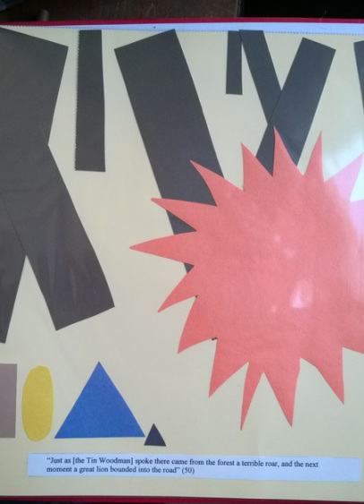
Picturing the Wizard of Oz
Brynn Kairis |

Mary Engelbreit's Queen of the Kitchen Cookbook p. 24
|
Fall has always been my favorite season. This is due, in large part, to the fact that with falling temperatures, I can crank up the stove again and take up one of my favorite past times: cooking. While flipping through my copy of Mary Engelbreit's Queen of the Kitchen Cookbook this morning, I came across a recipe for gumbo that caught my eye (and not just because it looks delicious).
This image is an example of a conceptual representation. Unlike the narrative representations we've covered in class up to this point, it does not seek to tell a story. There is no actor, no vector, and no goal. Rather, it seeks to represent the overall concept or idea of "soup" (and a specific kind of soup at that). In this case, the conceptual representation is an analytical process. Like most recipes, it represents the finished product/soup as a Carrier (the whole) and all its ingredients as Possessive Attributes (the parts). We can clearly see how all of these parts come together to form a complete, scrumptious meal. Recipes such as this one make identifying parts easy, as they are described in detail on the opposite page. I also find the small illustrations adorning the page interesting. In this section of the book, which is devoted wholly to soups and sauces, each page is decorated with tiny stacks of colorful bowls. While these bowls may not be a part of "soup" itself, they are a part of the "experience of eating soup", and thus relate to the overall concept/section and tie each of the various recipes together. In this case, I wonder if the greater concept becomes a classificational process? The superordinate in this case would be "Making and Eating Soup" with each of the soups, bowls, silverware, and ingredients acting as subordinates. It may be a stretch, and is something I'll have to consider further. |
September 30th The Gaze
|
I saw this ad for the new television show, "The Affair", while casually flipping through a magazine in line at the grocery store. It actually made me pause mid-flip to look closer at the image... it made me uncomfortable. I think that this discomfort is created mostly by the use of gaze in the image. The woman in the foreground, with her back to the viewer, is looking away and toward the left. In the words of Kress and van Leeuwen, she is presenting an "offer" - something for the viewer to see and consider but not interact with. The man behind her, however, is looking straight at the viewer. His gaze relates a "demand" as he makes direct eye contact. As a viewer, I become an active participant in the image. This gaze is obstructed by the woman - it's as if he is looking through her. This curious combination of both demand and offer leaves me feeling like I don't quite know where I fit in with the image - it's as if I've been caught seeing something that I'm not supposed to see. Overall, this seems pretty effective considering the show being advertised is based on infidelity.
|

An advertisement for "The Affair", seen in a magazine
|
October 7th Reality, More or Less...

Vincent van Gogh "Starry Night" 1889
|
Vincent van Gogh is by far my favorite painter. His paintings relate a view of the world that is at once beautiful, unsettling, and slightly unhinged from reality. I chose his most famous painting, "Starry Night" as it seems a perfect example of the use of "modality markers" to represent the world in naturalistic vs. abstract ways. In this instance, color saturation, differentiation, and modulation all work to create a sense of the familiar and yet unreal. The painting has a high color saturation with its use of rich blues and golds, and the modulation of color is also high as a multitude of blues are used to achieve the flowing, slightly frenzied look of the night sky. Color differentiation is not as high as saturation and modulation, as van Gogh did not use a diversity of color. Yet, the sharp contrasts between the blues, dark shadows, and golds have a startling effect. Overall, each of these three modality markers tips just over the edge from naturalistic representation into the abstract. The form of the town under the night sky with the cypress trees in the foreground is still recognizable, yet it is viewed through a lens that is no longer grounded in reality.
|
October 14th Flow Charts and Vectors and Symbols, Oh My!
|
I am not going to pretend to know what this flow chart is attempting to explain. My husband posted the link to his wall on Facebook, with an article titled "Teracool Pairs a Data Center with an LNG Terminal to Conserve Energy." What drew my attention was not the overarching concept, but the way in which the chart conveys meaning. As Kress and van Leeuwen have pointed out, flow charts are an example of the use of vectors to demonstrate the interaction between participants. In this case, the vectors are literal arrows showing directionality. What I find interesting is the integration of different arrows to show motion (as in the turning arrow between "turbine" and "generator"), and symbols to represent types of action (lightning bolts to show the exchange of electricity between "generator" and "data center"). Even knowing nothing about the subject of the chart, as an uninformed viewer I would be able to tell you that the "turbine" works in a spinning motion (excluding my knowledge of the fact that this is what all turbines do) to contribute power to the generator, and the generator directs this power through electricity to the data center.
|

http://www.techrepublic.com/article/teracool-pairs-a-data-center-with-an-lng-terminal-to-conserve-energy/
|
October 22nd Memes

http://contexts.org/articles/fall-2013/memes/
|
The "drunk baby" is a meme that I have seen often. Memes like this one are extremely popular online, and in my opinion this popularity stems from their flexibility. People can add whatever text they want to a stock image to tweak and create slightly new meanings. As such, I picked this image as an example of how text and image interact in memes to create meaning. On its own, the image of a baby making a strange face next to a pint of beer may be amusing, but no real meaning is apparent (apart from the fact that the baby appears drunk and this is funny because it is inappropriate). It is the text that people assign to the image that completes the package - the funny quips or observations about every day life that other viewers can relate to, read in relation to the image, and understand how the two fit together. In this instance, the words add to the image and complete the overall message (a humorous spin on a silly baby game). It is what Barthes called "relay", as the text extends the image and adds a final piece in the "meaning" puzzle.
|
October 23rd Persepolis and Representations of Torture
 Persepolis, Marjane Satrapi
Persepolis, by Marjane Satrapi, is another book that I first encountered during my Literature of Childhood class. This page outlining Marjane's first imaginings of what torture must be like has been stuck in my mind ever since. Part of this is due to the overall character design and illustration style. It is extremely simplistic, with soft, round, cartoonish shapes. Facial expressions are not complex, and emotions are distinguished by focusing on the key features of the mouth, eyes, and hands. It seems childish, as we view revolution and violence through the lens of a child's perception. Perhaps this is why the torture scene is so striking and disturbing. It is graphic, but not detailed. Not gory, but extremely painful to see and relate to. The torture victim is shown in strained, submissive postures with fists clenched and mouth open wide.
I find it interesting that these instances of torture are not bound to any specific panels - they are free floating imaginings that run through Marjane's mind as she stands in her living room with her family, discussing the victim. They are obtrusive as they dominate the top half of the page, but they are not grounded in reality. It's as if Marjane can't find a place for them in her present world. Structure returns with the short, wide panel of Marjane standing on the other side of the door from her iron and ironing board... she is separated from the appliances as she considers how domestic tools, symbols of work in the home (possibly women's work) could be used for torture.
The final panel, in which she imagines the dead torture victim, is arresting. It switches abruptly from a white background to black... giving a sense of darkness (and being buried). The body, which as been "cut to pieces," is not shown in its true gory state. Rather, Marjane imagines him sliced neatly (with no blood), all his major body parts separated and yet lined up with one another like puzzle pieces that just need to be pushed together. The effect is that the man has been reduced to his essential elements, the parts that make up his whole. She can't imagine the brutality of a human being completely dismembered, and so we get this unsettling image of the parts mimicking their place in the whole, and yet not quite assembled.
These panels depicting torture and death are huge on the page, while the panels depicting Marjane are small, pushed to the margins or squished between images of violence. It relates the sense of how small Marjane feels in the face of such atrocity, and marks a point in her life when she becomes obsessed with the idea of torture (detailed further in the following pages).
October 27th Farmer Fred... aka Trever

Found in my local Walmart
|
I stumbled on this friendly face while browsing the produce section of my local WalMart (not the best place to buy quality fruits and veggies, I'll admit). I thought it was interesting that this big bargain-brand store would choose to install such a down-to-earth image in their aisles. The wish to present naturally and locally grown, personally delivered products is evident. It puts a face on an otherwise faceless corporate entity and encourages people to feel a personal connection to the product. This sign is posted so that shoppers are eye-level with Trever from High Acres Farm. He looks right at them, his gaze representing a "demand" to make a connection, trust him, and buy his product. This image also represents an analytical process, with Trever acting as the "carrier." His "possessive attributes" are all of the things that lend him legitimacy as a farmer in the consumers' eyes - blue jeans, a plaid shirt, a basket of apples in a field, a sensible haircut and a warm smile.
|
October 30th Another Drop in the Sea of Anti-Smoking Ads
|
We have seen an abundance of anti-smoking ads in this class, probably due to the fact that ads concerning smoking have evolved greatly over time. The latest group that we looked at has been extremely controversial, representing both a person and smoke taking the shape of some object that signifies death (i.e. a smoke-knife, a smoke-noose, or a smoke-halo). This picture disturbs me far more than any of the pictures we viewed previously, and it took me a moment to figure out why.
In the case of all the other images, we decided as a class that they represented a mixed modality. While the people (or body parts) depicted were highly realistic, the smoke was shown taking forms and shapes that it would never assume in real life. I suppose this made the pictures seem not as threatening. In this image, though, the smoke swirling around the child's head does truly look like a clear plastic bag. I actually had to stare at the image for a bit before I realized it WASN'T a bag. This image doesn't use mixed modality, it uses high modality through and through. It seems more REAL, and makes more of an impact (on this viewer at least). |

|
November 4th Poor Richard's Sculpture
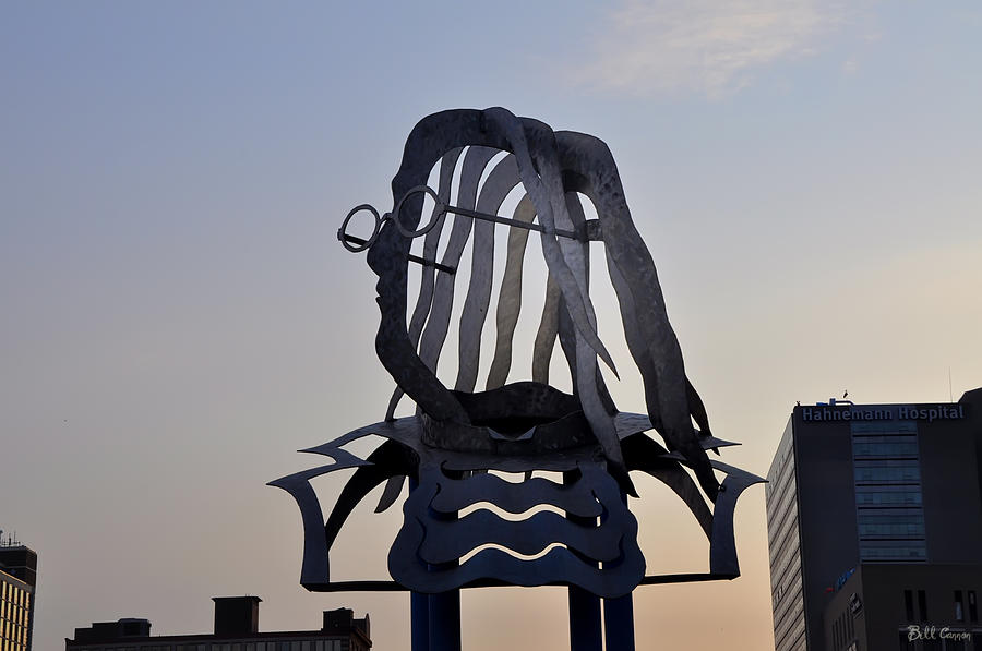
http://fineartamerica.com/featured/the-ben-franklin-sculpture-bill-cannon.html
|
Every time I go to Philly, I keep an eye out for this statue that presides over the Ben Franklin parkway. Out of all the statues Philly boasts of Ben, this is my favorite. Kress and van Leeuwen write about statues and their ability to use three-dimensionality to present new ways of viewing, interpreting, and interacting with an image. Ben is meant to be viewed from all sides and all angles. This, combined with the statue's modern "cut out" structure, allows the viewer to see the cityscape literally through Ben. As he is poised looking out over the city, his iconic glasses acting as a marker for us to recognize him, we see Philadelphia through this forefather's eyes.
|
November 8th Visualizing Mental Illness
|
This page is from a graphic novel by Darryl Cunnhingham that I read earlier this year titled Psychiatric Tales. It chronicles the author's experiences as a psychiatric nurse as well as someone who struggles with mental illness himself. When we were reading Scott McCloud's Making Comics, I kept thinking of this book. McCloud spends some time discussing backgrounds and how important they are for allowing readers to step into the world of the story. In Cunningham's book, however, there are very few backgrounds. Images are decontextualized; there is no real sense of space or groundedness.
This page serves as a good example. Characters and objects are often floating in the panels. When a room (or even floor) is pictured, such as in panel 3, it is off-kilter - tilted one way or another so that nothing is level or sure. Cunningham creates a disoriented, frenzied feeling as he talks about "tension" on this page, using stark and jagged black and white stripes in several places. Figures flip back and forth between white and black in relation to the background, standing out in relief against the decontextualized setting. The overall effect is one which relates the disoriented feeling of mental illness. The character, and the reader, feel disconnected with the world, which is a starkly mysterious, frightening, nonsensical place. Cunningham masterfully slips us into his shoes and allows us to see what he sees and feel what he feels. |

"Psychiatric Tales"
Darryl Cunningham
p. 127
|
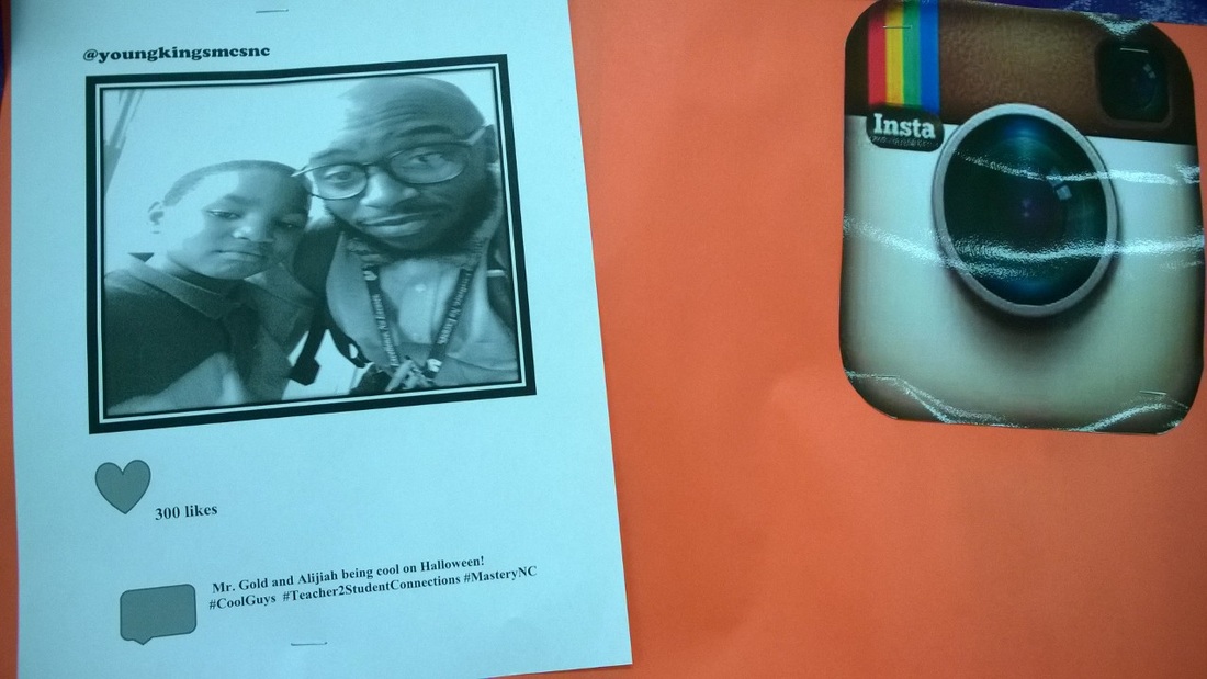
November 11th Constructing Screens in the Classroom
|
Every Monday, I teach knitting in an after school program. The school where I work allows me to use a classroom space that is dedicated to helping students with behavioral difficulties. The layout of the room and some of the images displayed are different than your typical classroom. From what I can tell, these students have difficulty relating with one another, communicating their feelings and needs, and feeling like a part of the school community. As such, their surroundings are designed to help foster a sense of community, comfort, and belonging.
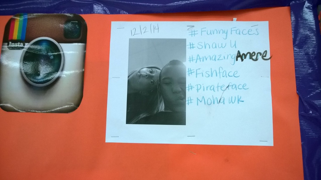
Recently, a social media bulletin board with images from Instagram has been added. The image that it includes so far is one of a teacher and student on Halloween. They are shown as happy and proud, standing close together as if they are comfortable with one another. Hashtags reinforce the idea of togetherness. I find it interesting that this image, and the board in general, is meant to visually recreate in the classroom what students are used to seeing everyday on their computer screens. Social media communities are ones which these students are familiar with, and they help create a sense of connection between teacher and student. The students take ownership of their relationship with teachers and each other by taking an active part in contributing to this image. It almost acts a map, drawing out relationships and reinforcing connections for students who find interpersonal communication extremely difficult. **Update 12/8 - an second "instagram" image has been added to the board! I posted it here as well. |
November 14th Effective Depictions in Infographics
|
Randy Krum uses this image in Cool Infographics to illustrate a "call to action" asking viewers to donate money. However, what I find interesting about this infographic is its choice to represent human beings in a fairly realistic way. We've spoken in class about the need to keep things simple in infographics. The most effective way to accurately relate information is often to simplify figures. Yet here, the designers have chosen a highly realistic human silhouette. Viewers can make out tiny fingers and toes, as well as musculature.
I believe that this is due to the nature of the infographic and the specific type of information being conveyed - the visual representation of human deaths as a result of cancer. Designers need to drive home that these are people; fellow human beings just like us (not just some men's room sign stick figures). By using this distinctly human shape, the point is driven home more clearly and directly. It may evoke a stronger reaction in viewers, who then may be more likely to donate money to the cause. |

"Cool Infographics" Randy Krum p. 77
|
November 16th Equal Opportunity Advertising
 http://i.imgur.com/6FZS0JL.jpg http://i.imgur.com/6FZS0JL.jpg
|
I found this image through the website "imgur" while I was browsing on Reddit. It is an ad from Nordstrom, and was posted to the site because it includes a model in a wheelchair. I feel like this is something we don't see very often at all, probably because often disability does not fit into our ideal view of "beauty," "fashion," or "success." These are all concepts which advertisers want to convey to consumers, and perhaps this is why disabled or impaired individuals are rarely represented in this context. As someone who grew up with a disabled person (my grandmother has been in a wheelchair for most of her life) this lack of representation has always bothered me.
What I like about this image is that it does not work to highlight OR deny the wheelchair. The image is decontextualized, just like the standing model's photo. No background is present (apart from a plain blue backdrop) which might try to explain or draw attention to the differences between them. The body is an intrinsic part of personhood and identity. In this instance, the model is portrayed as the person she is, or whatever person audiences might imagine she chooses to be. The aim is to advertise clothing, but I think the photograph argues a much deeper point, and one that is sorely needed. Those that are disabled are not relegated to "ugly," "unsuccessful," or "undesirable" labels. The model meets the viewer's gaze directly in a demand to be recognized on equal terms with model at left. As a disabled person, she too can live her life like the rest of us and be a person that viewers can admire or look up to. |
|
This book is a tried and true favorite of mine. It's the memoir of author John Elder Robison and details his struggles growing up with Asperger's in a time when the syndrome was not yet recognized, understood, or even tolerated by medical professionals (let alone the general public). I first came across the book at Barnes and Nobles, and was immediately drawn to its cover.
The cover is naturalistic. The extreme close up on the boy's face immediately jumps out and demands connection, especially when viewed on a shelf among a sea of faceless book covers. However, the reader/viewer is denied such a connection as the boy's eyes are squeezed tightly shut. Is this expression defiant or fearful? The image represents a "demand" in Kress and van Leeuwen's terms, but does so with a distinct lack of gaze as opposed to the presence of one. The image, like the boy, screams for attention and yet refuses to interact. This broken connection is reminiscent of the symptoms of Asperger's - many of those with the syndrome are extremely uncomfortable (and sometimes unable) to look another person directly in the eyes. It puts the viewer in the place of this author's parents, teachers, and (later) employers. We, too, feel their frustration/confusion and wonder what is "wrong" with this child and why he "refuses" to connect. |

Book cover "Look Me in the Eye" John Elder Robison
|
November 27th Black Friday
 http://www.collegehumor.com/post/6941244/black-friday-emergency-survival-guide
I came across this image while browsing the internet on Black Friday. It is meant to be humorous, but also makes a social comment on our consumer-driven society and the frenzy that results during the biggest shopping day of the year. What struck me is its use of the typical airline safety manual format, taking a style that most are familiar with as an instructional tool. The similar format equates airplane crashes with Black Friday mayhem. Figures are not shown in great detail, and the actions are fairly decontextualized with a lack of distinct background. The "action-to-action" layout is typical as the important steps of each activity are highlighted (McCloud 15). This image also flouts these aspects, as it represents gore in a way that an airline safety manual certainly never would. The text included also provides an "elaboration" of the images by extending their meaning and further making the social comment (Kress and van Leeuwen). They literally ask "what's wrong with society?"
December 2nd Look at Me! Look at Me!
|
With this selfie, also featured on our course webpage, Ellen Degeneres surpassed Barack Obama as having the most re-tweeted image in history. As even the most casual user of social media will tell you, selfies are every where. While what sent this photo skyrocketing into internet fame was its inclusion of a huge number of celebrities, what I find interesting is the presence of several different "typical" selfie poses that are present. There seems to be a specific system of significance and meaning in place (semiotics of the selfie?).
One of these typical poses can be seen in the head tilt, either with chin pointed up or down, of Jennifer Lawrence and Julia Roberts. This common pose exposes more of the face and often marks an attempt to capture one's best angles to look the most attractive. In this sense, selfies are an "offer." In the case of the head tilt, the participant's gaze often does not directly meet the viewer's. This is not surprising, as the participant is literally offering themselves, and what they are doing, up to the audience for inspection. Another key pose is the slightly opened mouths of Kevin Spacey, Meryl Streep, and Ellen. This often occurs in humorous or amusing contexts, and is an attempt to show "how much fun I'm having." I should note that selfies often include a "demand" as well. For example, some participants in this image are staring directly into the camera. The selfie "demand" includes the particpant's desire to be recognized. The selfie is nothing if not a declaration of "Look at me!" |

http://www.theguardian.com/film/2014/mar/03/ellen-degeneres-selfie-retweet-obama
|
December 4th Photoshopped "Girls"

http://blogvecindad.com/wp-content/uploads/2014/01/lena-dunham-jezebel.jpg
|
Photoshop has been an interesting topic of discussion in our class. When discussing the use of photoshop, and how it affects viewers' perceptions of reality, I can't help but think of "Girls" creator and star Lena Dunham. The blog Jezebel slammed Dunham earlier this year for photoshopped images of her that appeared in Vogue magazine. For the most part, the public is aware that photoshop exists and is used extensively on models and actresses, especially in high fashion magazines. The outrage over this particular actress being photoshopped stems from the fact that she is known for her "realistic" body image. As an average-sized American woman, she often appears nude on the show and has been applauded for her refusal to give in to the industry's unrealistic standards of beauty.
In the image at left, Jezebel clearly points out all that's been done to change Dunham's features, including slimming her down, raising her neckline, and changing her facial structure. A filter has been applied to the image, giving a chic blue tinge which also helps to hide any imperfections in the skin. I wonder how we as the viewer are expected to perceive the real world, when even an image of a woman who is famous for being "real" has been altered. There seems to be a strange balance here between Dunham maintaining an offbeat sense of difference from industry standards, and yet applying these same standards in small doses to make her "acceptable" for Vogue. The sense is that Dunham has permission to rebel, as long as she doesn't rebel too much and still fits in with the basic mold for what the industry will allow. She pushes the envelope, but only so far. |
